In this article, we present three different ways to visualize COVID-19 mortality rates for Italy and England in a hospital setting, split by age and date to illustrate country differences and how these have developed during the pandemic.
While this analysis represents only specific measurements from just two countries, its value – and the value of other analyses like it – goes beyond that: It is another contribution to our industry’s general understanding of COVID-19 and to the larger global effort to combat the disease. As we work from an incomplete picture of COVID-19 and its mortality implications, continuing to gather, evaluate, and compare various data points from different parts of the world will be essential in answering important questions:
Is there an age-shape to in-hospital mortality?
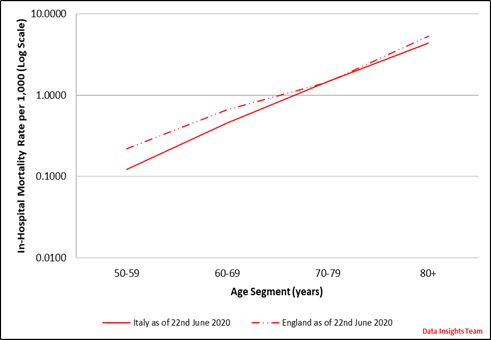
Figure 1 shows that the age-stratified in-hospital mortality rates for both countries are almost straight lines on the log scale, which means that mortality increases exponentially with age. There are some notable differences in the shape between Italy and England.
Figure 1

How has in-hospital mortality developed week by week?
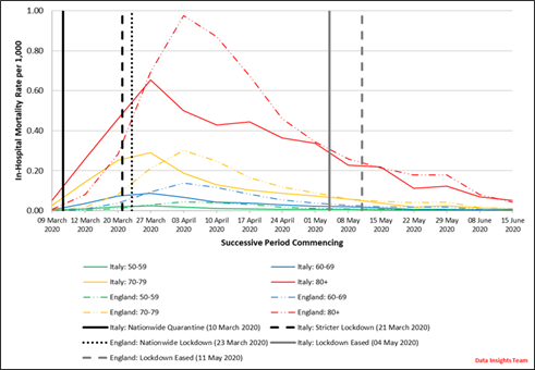
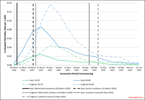
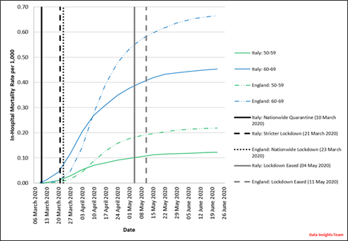
In Italy, mortality rates peaked across all ages during the period March 27 to April 3, just over one week after the introduction of the strict lockdown on March 21 and almost three weeks after the initial nationwide quarantine enforced on March 10.
By comparison, after the start of lockdown in England on March 23, COVID-19 hospital mortality continued to increase rapidly for almost two weeks, until the period of April 3-10.
Italy and England eased lockdown measures on May 4 and May 11, respectively, and Figure 2 illustrates how in-hospital mortality rates have continued to reduce since then.
Recently, the Centre for Evidence-Based Medicine at the University of Oxford reported a steep and continual decline in the overall number of COVID-19-related deaths in hospitals in England over similar dates (i.e., March 24 to June 19). Although the reasons explaining this finding are unknown and require further research, the authors of the analysis stated several potential reasons that can be found here.
Figure 2


What do cumulative in-hospital mortality rates look like?
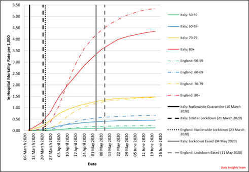
As illustrated in Figure 3, England’s cumulative hospital-related COVID-19 mortality rate as of June 22 is around 80% higher than Italy’s for age 50-59, 50% higher for 60-69, broadly equal for 70-79, and 25% higher for 80 years and older.
Part of the reason why England’s mortality rate is higher than Italy’s is because England uses a wider definition of what counts as a COVID-19 death, including suspected cases where COVID-19 is mentioned on the death certificate. Other reasons for the difference will include cultural, behavioral, and socioeconomic differences, as well as differences in healthcare systems, testing rates, and government strategies implemented to tackle the virus.
News media widely reported Italy’s healthcare capacity issues early on in its pandemic, and we may have seen a different picture (e.g. a higher in-hospital mortality in Italy) had we instead investigated in-hospital mortality in specific regions.
Figure 3


Summary
Visualizing mortality rates in this manner helps us understand differences between countries and their development during the pandemic so far. Exploring data from countries that started to experience the pandemic sooner may help inform how mortality may develop in countries that are in an earlier stage of their pandemics, although it is important to remember that such development might occur in different ways in future. Ultimately, this improved understanding helps inform the models that (re)insurers use to estimate the ultimate mortality impact of the pandemic.


